
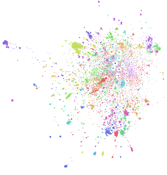
Click on the image above to visit an interactive version of the reddit map discussed below (not supported on mobile). Jump to the bottom of the article if you’d like to see a selection of community clusters I found interesting.
Background
For about two years now, I’ve played with different approaches to investigating the community structure of reddit. A year ago, I published a “map” of reddit (that I had actually built nearly a year prior, just hadn’t written up). The approach I used was motivated by a particular unusual dataset I’d collected. It worked out really well, but I wanted to build a more “complete” picture of the reddit community. In particular, I wanted to build something that would be generally useful for other people. In my analyses over the years, I have discovered a lot of interesting corners of reddit: some of these are just fascinating that they exist at all (e.g. the surprisingly sprawling, albeit currently inactive, communities that have sprung up around April fools jokes), but others were actually extremely relevant and enjoyable to me personally, and I wouldn’t have discovered them were it not for the tools I’d build for my personal analyses.
There are two main ways users discover new subreddits. They either find them looking for something specific, like maybe trying to find a community associated with a TV show, or they stumble across them by chance. “By chance” generally manifests as one of the following situations:
* Content from a subreddit the user didn't know about appears on the /r/all frontpage, which aggregates content across reddit
* An unfamiliar subreddit appears in the "trending subreddits" list
* A comment links to or discusses the existence of an unfamiliar subreddit
* An unfamiliar subreddit is listed in the sidebar or wiki of a subreddit the user frequents, as part of a list of "related communities" that many subreddits curate for their users
* The user subscribes to a subreddit promotion service, like /r/SubredditOfTheDay
Unfortunately, many of the gems on reddit are extremely esoteric and have such narrow focuses that it wouldn’t even occur to most people that a community would exist around them, such as /r/ImageStabilization, /r/INTP, or /r/RandomActsOfAmazon.
As users spend more time on the website, they become more skilled at navigating the ecosystem and finding what’s out there and what’s relevant to their interests. There’s an unfortunately difficult learning curve for new users: reddit is a big place and it can be difficult to explore. In the absence of a user-tailored “because you liked these subreddits, you might also like X, Y, and Z,” we can facilitate subreddit discovery by providing a mechanism for users to explore subreddits at a high level to see what’s available to them.
A quick tutorial on bipartite network analysis
A network is called “bipartite” or “two-mode” if the nodes in the network can be divided into two separate collections (i.e. classes) such that no node connects to any nodes of the same class, only to nodes of the opposite class. Social networks like reddit are often modeled this way: users and subreddits are nodes, and users are connected to subreddits based on their activities. An operation called a “bipartite projection” or “unimode projection” is commonly used to form connections between members of the same class through members of the other class. The most common approach is to create edges between members of the first class weighted according to the number of nodes they share in the second class. For example, we could connect users together by counting the number of subreddits in which they both participated, or connect subreddits by counting the users who participated in both.
To construct the graph described below, I perform exactly this bipartite projection, but with an additional edge weight normalization step: instead of weighting edges based only on the counts of mutual users between them, we divide the edge weight by the degree in the bipartite network (the count of users attached to each) of the nodes in turn, to create two separate “directed” edges where each edge is weighted according to the user count of the target of the edge. The weight of the edge is then interpretable as “what is the proportion of members of the target community who also participate in the source?” or alternatively, “what is the estimated probability that a member of the target community, chosen at random, is also a member of the source community?” This way, we can differentiate between 1000 mutual users between two subreddits that each have over 1M users (a weak relationship), and 1000 mutual users between two subreddits that each have about 2k users (a strong relationship. Additionally, if one subreddit has 1M users and the other has 2k users, we can construct an edge whose direction suggests that the smaller subreddit is a specialization forked from the larger community (this is why we weight by the degree of the target node: if we only end up keeping one of the two edges, the smaller community will always be the edge’s target).
(warning: incoming greek)
Let \(n\) denote the number of nodes of the primary class (in this case, subreddits), and \(m\) denote the number of nodes of the secondary class (users) through which we would like to connect nodes of the primary class. Let \(A\) denote the \(n x m\) adjacency matrix of the network. Let \(P\) denote the one-mode projection onto the primary class.
The simple bipartite projection is equivalent to calculating the number of length-2 paths between each pair of nodes in the network. There’s a convenient linear algebra trick for calculating this: \(P=A*A^T\). The bipartite node degree \(d\) is then given by the row vector \(d=rowsums(A)\). Then the edge normalization described above is performed simply by elementwise dividing \(d\) with the transpose of \(P\) and then taking the transpose of the result.
Concretely, here’s a code snippet demonstrating how to perform this operation in R:
I seriously doubt this is a truly novel approach, but although I haven’t done a thorough lit review it at least isn’t particularly common, to the best of my knowledge. I’ve found it to be extremely effective in this project and recommend it to other researchers investigating similar bipartite social networks.
Methodology
As the goal here is to provide a tool for people to discover individual subreddits and larger communities that may be interesting to them, I decided to constrain my attention to just the last two years of public comments to learn inter-subreddit relationships, and then to further constrain attention to subreddits that have achieved a threshold of activity within the last three months. Additionally, to learn relationships between subreddits, instead of just looking at all of the mutual users between two subreddits, I determine if a user is active in a given subreddit at some period, and then count mutual active users between two subreddits in that period (i.e. perform a bipartite projection onto the subreddit node set). We can contextualize that raw count as a proportion by comparing the number of mutual users between two subreddits and dividing by the total active users of each, respectively, to determine the relative proportion of users the two subreddits share (i.e. the edge normalization procedure described above). This procedure is repeated for fixed windows in the data to ensure that relationships indicate users are active in both communities at the same time. The resulting sequence of graphs are then flattened into a single graph by taking the max observed weight for each edge. Finally, we filter out subreddits and edges by applying thresholds discussed below.
That’s the high level overview. Concretely, here’s how this graph was constructed:
-
Public comments between January 2015 and November 2016 (via the public comments dataset on Google BigQuery collected by /u/Stuck_In_the_Matrix and published by Felipe Hoffa) were aggregated to determine, for each month, how many unique submissions each user commented in in each subreddit in which they participated.
-
A user is defined as “active” in a subreddit if they commented in at least 3 separate submissions in a given month. This definition might be somewhat aggressive and if I were to change anything in this experiment it would be to reduce this threshold to 2.
-
To be considered for relationship inference in a given month, a subreddit had to have had at least 10 active users that month. Call subreddits satisfying this condition “active subreddits”.
-
Relationships between subreddits were inferred by counting the mutual users between active subreddits. Relationships with fewer than 2 active users in common were ignored.
-
Bidirectional relationships were then converted to directed relationships, weighted according to the count of mutual active users between the two subreddits divided by the total active users of the target of the relationship (in a given month). Call this the “mutual user ratio”
-
Relationships with a mutual user ratio below 0.1 were ignored. This threshold was chosen qualitatively and I’m fairly satisfied with it. I could have been “more statistical” by, instead of using a fixed ratio, doing a test of proportions for the hypothesis that the mutual user ratio is greater than or equal to 0.1, but I doubt that would have given especially different results besides being less forgiving to subreddits with very few active users and adding significant computation time. Applying statistical significance here might give the air of increased validity, but I think it’s the wrong approach.
-
Relationships were then aggregated by taking the max of the observed mutual user ratio across all months to flatten the time dimension.
-
Subreddits that had an average of fewer than 1 active user in the last three months of the data were then dropped from the graph to attempt to direct users of the application to subreddits with active communities, rather than subreddits that were active at some point in the data but are now dead (e.g. the sprawling communities that formed around the 2013 or 2015 April Fools pranks. See /r/TheButton, /r/Periwinkle, or /r/Orangered for entry points to these communities).
-
Additionally, drop subreddits that, after applying the above procedures, have degree zero (i.e. aren’t connected to any other subreddits). This has the effect that subreddits that were not recently active or where a relationship could not be inferred are excluded. Notable examples of ignored but active subreddits include /r/MapleStory, /r/MSLGame and /r/Indonesia.
-
Identify communities algorithmically (via Gephi’s modularity method with reduced resolution chosen qualitatively)
Previous work
I want to give a shout out to Dr. Randal Olson (/u/rhiever) who was one of the first people to experiment with mapping reddit, and certainly the first to go about getting his results published academically. My approach is similar to his, both in how edges were inferred and how the data was visualized, but I want to highlight a few key differences:
-
Where Randal looked at all mutual users between all subeddits, I make an effort to constrain attention to users who can be described as “active” in those subreddits, and additionally constrain attention to subreddits that were recently active to avoid directing users to “dead” communities.
-
Where Randal colored nodes in his visualization based on their degree, I colored nodes based on their community membership and in such a way as to maximize the perceptual difference between any two random communities. Details below.
-
Additionally, I provided a mechanism to allow users to constrain their attention to the algorithmically inferred communities in the reddit graph. To help users navigate these communities, I labelled them according to “prototype” subreddits. I designated the two most active subreddits in each community as the labelling prototypes. This gave very good results, but in retrospect I might have gotten better results for a handful of communities if I had instead designated prototypes based on subscribership (e.g. the “RocketLeagueExchange/DestinyTheGame” community would instead have been labelled “ps4/DestinyTheGame”).
-
Randall inferred edge weights from a simple bipartite projection, whereas I used an edge weighting scheme that contextualized mutual user counts as population proportions.
-
Where Randal used a statistical approach determine which edges to remove, I leveraged subject matter expertise to construct appropriate thresholds. This seems like a subtle choice but I think it is an extremely important distinguishing feature because I think Randal’s approach was actually deceptively aggressive. Let’s dig into some of the nuances behind this particular decision.
Edge significance
The general technique Randal employed for identifying “significant” edges goes like this (I haven’t read his article or the original edge significance article in some time so I might have some of the minor details fuzzed):
- Calculate the “strength” of a node (i.e. subreddit) by summing up the weights of all of its edges. This is done separately for incoming and outgoing edges.
- Calculate each edges normalized weight as (edge weight)/(node strength).
- There’s a special distribution we can reference to determine what we would expect a “random” edge’s normalized weight to be as a function of the degree (number of edges) of the node whose strength we’re scaling from. For anyone interested, this distribution is constructed by estimating the expected length of any segment resulting from slicing up a unit distance into “n” pieces, where n is the node degree and the index of each cut is drawn from a uniform distribution (such that there are n-1 cuts to give n slices).
- This leads us to a traditional frequentist statistical test: we choose a significance threshold (somewhat arbitrarily) to get a cut-off normalized edge weight, which can be interpreted as “100*(1-threshold)% of edges with normalized strength weaker than the cut off are extremely likely to be ‘random’ edges that we can ignore.”
- Drop all nodes that aren’t connected to any edges after applying this procedure.
This approach has the effect of preserving the “multi-scale” structure of the network, which essentially means that we can use this technique to extract a smaller version of the network that will exhibit statistical properties very similar to the larger network (aka the “backbone” network). If we’re mainly interested in calculating statistics on our network, applying this approach will make our lives (and calculations) a lot easier.
But, that’s not our goal. Our goal is to create a map that members of the network can use to navigate the network, and in particular discover esoteric sub-communities that may be relevant to them that they may have had difficulty finding via more “organic” mechanisms currently available. The application of a statistically inferred threshold is appealing because, frankly, people like p-values (despite the fact that most people don’t interpret them correctly, which is a whole other issue). But it’s still just a heuristic. Attaching a p-value to your heuristic doesn’t necessarily make it better or worse than an alternative that doesn’t leverage p-values, like relying on subject matter expertise.
My main problem with the “edge significance” approach is that it’s actually deceptively aggressive. Consider two nodes with degree one that are connected by a single edge with high edge weight: no matter what threshold we set, this approach will always eliminate that edge, dropping both nodes from the network. Imagine a sequence of nodes that are connected in a circle such that each node has degree two: every single one of those edges will be dropped by this technique, regardless of the weights of those edges. Similarly, imagine an arbitrarily large clique of nodes that are all connected by equally (high) weighted edges to each other and no one else: this technique will again cause us to drop all edges in the clique and as a result to drop the clique entirely. I’d posit that in all of these scenarios, the edges that were removed were objectively “significant” in the context of our goal, but application of this blind statistical approach failed us because we had alternative information we could have used to identify the importance of the edges we removed.
The edge significance approach is fine if we just want to extract a statistically similar subgraph, or in the absence of better heuristics for determining edge significance. But, we’re interested in much more than just finding the “backbone” subgraph, and we can actually construct much better approaches to identify “significant” edges here. There are definitely applications where this approach to edge significance is the best way to go, but I don’t think this was one of them (nothing personal, Randal. Love your work).
I hope to explore the difference between my approach and Randal’s more in depth in a later post, but let’s be honest: with my recent frequency of “1 blog post per year,” I wouldn’t hold your breath.
Coloring communities
Gephi (the tool both Randal and I used to build our visualizations) by default paints communities with a randomized color palette, but I found this unsatisfying. The resulting aesthetics can be messy, and just by chance a lot of colors end up being very perceptually similar.
To try to increase the perceptual difference between any two random communities, I built my palette by rotating through the HSL color space, which is a cylindrical color space designed based on the human visual system. HSL doesn’t actually exhibit perceptual uniformity, but it’s a reasonable approximation. In the future, I’d like to re-color the graph using a palette derived from the CIE color space, which does exhibit perceptual uniformity. The main reason I used HSL was because there is a simple interface to it in python, via the Seaborn package.

After deriving a sequential palette, I reorganized my palette by “striding” across the color indices with a stride of 5 (i.e. taking every 5th color).

The rationale behind this was to maximize the ability to distinguish between the largest communities, which are characterized by default subreddits and consequently are clustered together. By applying this shuffled palette to communities in descending order of community size, I was able to both maximize the likelihood that two random communities are distinguishable, maximize distinguishability of a handful of the largest communities (specifically the top floor(n_communities/stride) = floor(63/5) = 12 communities), and additionally create a pleasing rainbow effect in the middle of the visualization from the default subreddits.
Final thoughts
This graph is mainly powerful to help users find communities with similar interests where people are engaged in the comments. As a next step, I’d like to infer the reddit cross-posting network as well to identify subreddits that are related by content and merge that network into this one. This would capture connections to subreddits whose users may not be especially engaged in the comments, but where the content might still be interesting to someone exploring the graph.
At the very least, I hope to keep the graph up-to-date with the most current public comments dataset on google bigquery, which I think is one-month lagged to the live comment activity.
Some Results
I strongly encourage you to explore the interactive reddit map yourself. It unfortunately is not supported on mobile presently, so here are a few selected results as static images for people who can’t explore the graph themselves.
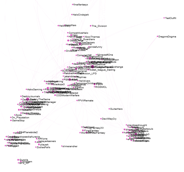
Console gaming (Xbox One and PS4. There’s also a Nintendo community, but it’s hanging out further away with the pokemon community) interest community:
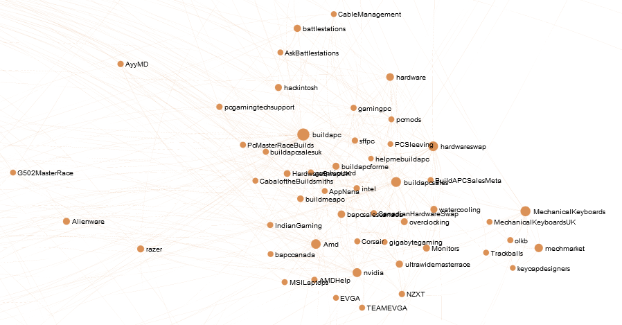
Detail of the computer hardware interest community surrounding /r/buildapc, a microcommunity embedded in the larger high-performance computing community characterized by /r/gaming and /r/pcmasterrace:
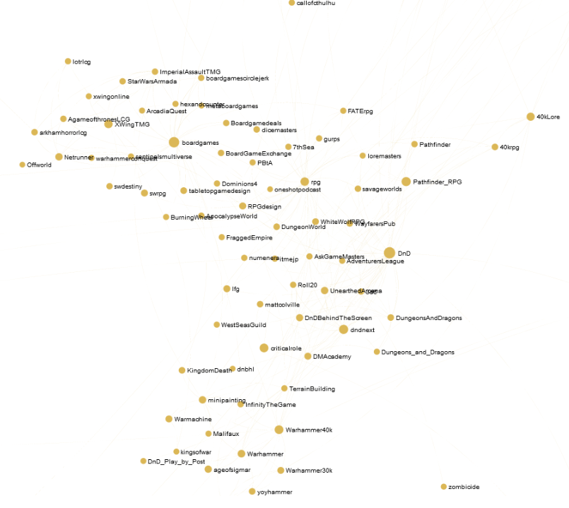
RPG and boardgames community:
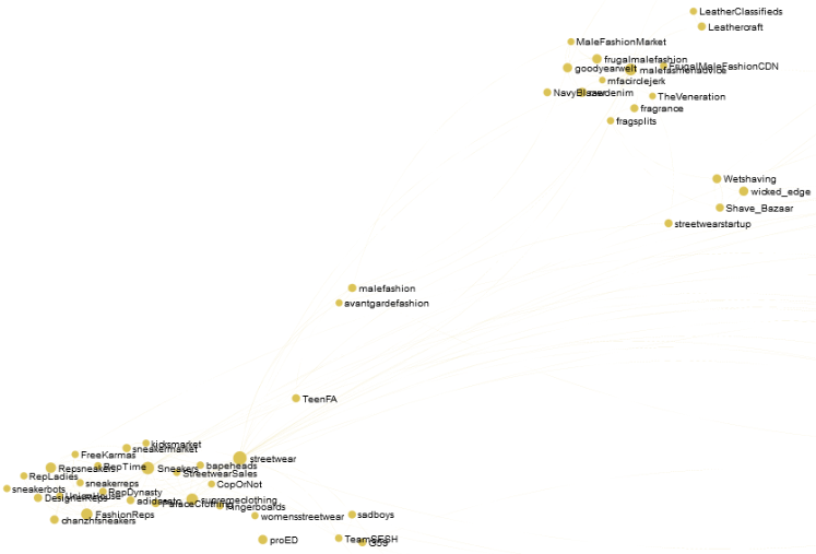
Reddit users are often stereotyped as being extemely nerdy, but don’t be fooled: there are some extemely stylish people on reddit. Here’s the men’s fashion and lifestyle interest community:
We’ve got jocks too: there’s a very large community focused on American Sports (which is right next to the soccer interest community, not shown):

I’m not even sure what to call this… the “drama” community, characterized by subs like /r/SubredditDrama, /r/ShitRedditSays, /r/KotakuInAction, etc.

The much smaller and surprisingly (to me) unrelated “red pill” community, which has a reputation for supporting misogyny:
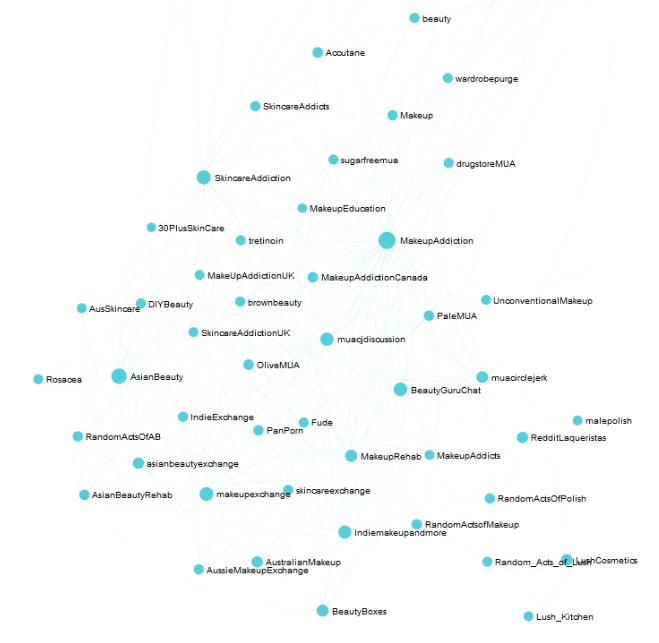
Reddit isn’t all men though: there are women too. There’s a sprawling community focused on makeup and beauty discussion:
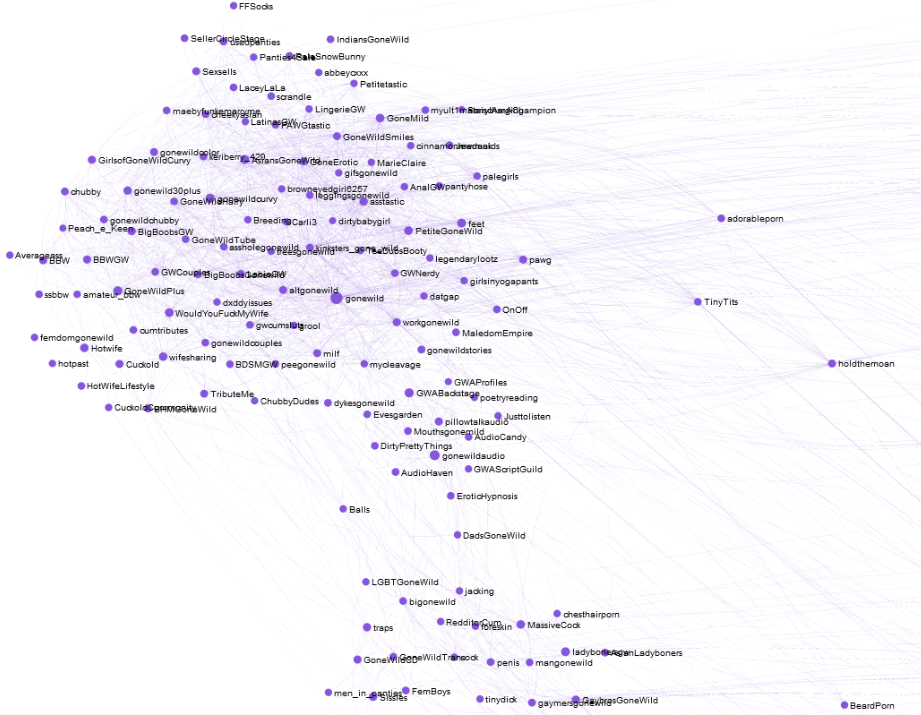
There’s also a large amateur porn contingent, aka the “gone wild” community:
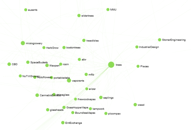
Here’s reddit’s stoner community:
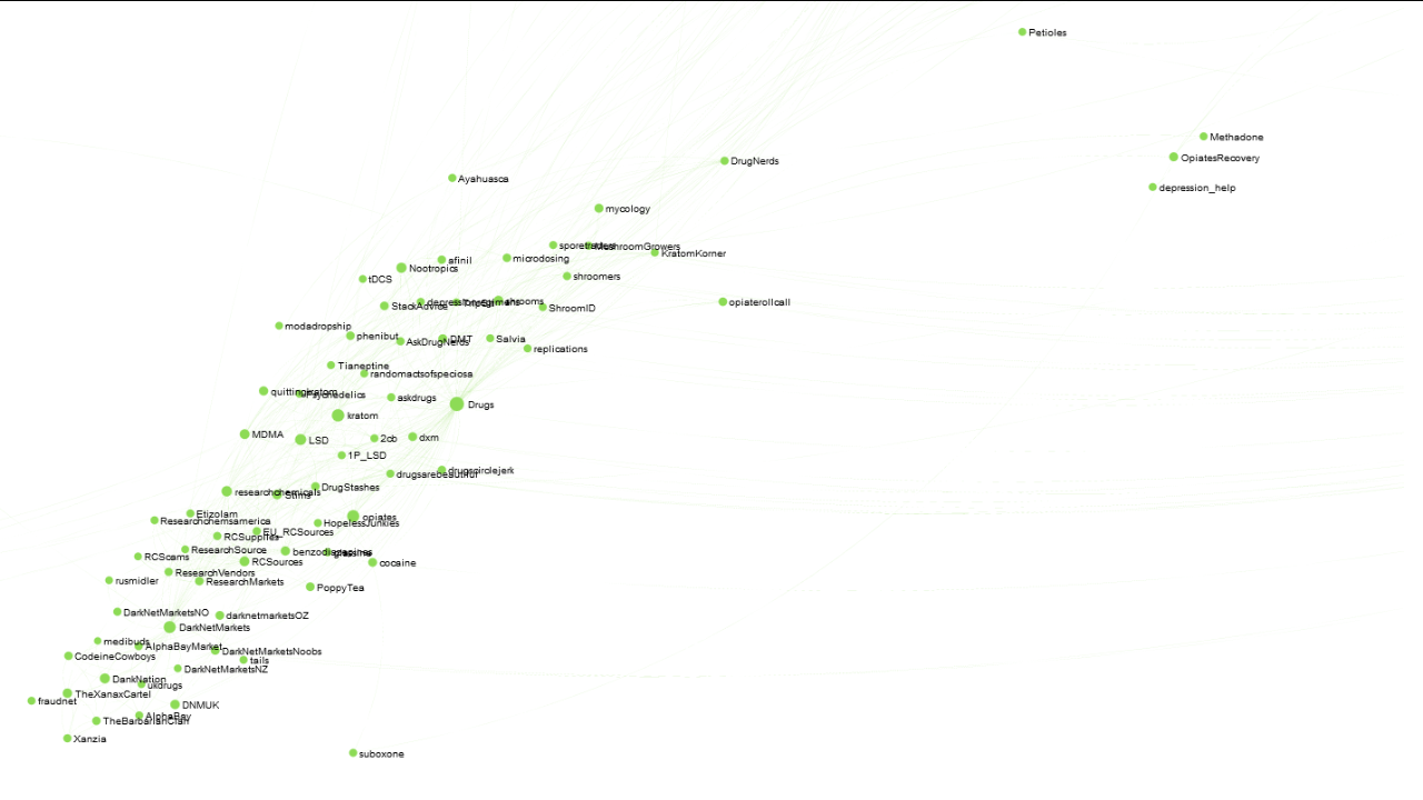
And finally, much lesser known than the stoner community, there’s a fairly large community geared towards general drug use, which interestingly (bu unsurprisingly) absorbs the smaller “darknet markets” community:
Acknowledgements
First and foremost, huge thanks to /u/stuck_in_the_matrix for collecting the dataset of public comments I used for this project. Also, thanks go out to Felipe Hoffa from Google, who published this data set as a public collection on BigQuery. Thanks also to Oxford’s OII and JISC for building the incredibly useful template that powers the sigma.js webapp, and finally thanks to Randy Olson for improvements he made to the template.