
(tl;dr: https://github.com/dmarx/Topological-Anomaly-Detection)
Recently I had the pleasure of attending a presentation by Dr. Bill Basener, one of the authors of this paper which describes an outlier analysis technique called Topological Anomaly Detection (TAD). Despite the intimidating name, the algorithm is extremely simple, both to understand and to implement.
The technique is essentially a density based outlier detection algorithm that, instead of calculating local densities, constructs a graph of the data using nearest-neighbors. The algorithm is different from other kNN outlier detection algorithms in that instead of setting ‘k’ as a parameter, you instead set a maximal inter-observation distance (called the graph “resolution” by Gartley and Basener). If the distance between two points is less than the graph resolution, add an edge between those two observations to the graph. Once the full graph is constructed, determine which connected components comprise the “background” of the data by setting some threshold percentage of observations ‘p’: any components with fewer than ‘p’ observations is considered an anomalous component, and all the observations (nodes) in this component are outliers.
As you probably gathered from my description, it’s a pretty simple algorithm to implement. Let’s walk through it step by step.
First, we need to construct a distance matrix. SciPy has a great utility for this called pdist:
from scipy.spatial.distance import pdist

distance_matrix = pdist(X)
One thing that’s nice about this is that it will work for either numpy arrays or pandas dataframes, as long as the observations are on the rows and the features are on the columns. The output of pdist is, by default, a “condensed” distance matrix, which is just the upper triangular matrix collapsed into a flat vector. This is nice because it takes up (just) less than half the memory, but it’s slightly more cumbersome to work with than a straight up distance matrix.
We’re ultimately going to treat this distance matrix as an adjacency matrix, but before we do, we need to replace all entries in the distance matrix (ok, distance vector) that are larger than the graph resolution “r” with zeroes to remove those edges from the graph. I think it’s a little silly to expect the user to come up with a discrete distance to use for the resolution, so we’re going to give the user the option to provide a quantile instead as the ‘rp’ parameter below.
It’s tempting to just modify the distance matrix in place, but we’re going to need it later to score outliers, so we’re going to work with a copy instead.
def trim_adjacency_matrix(adj, r=None, rq=.1):
    if r is None:
        # This is really just a lazy quantile function.
        q = int(np.floor(len(adj)*rq))
        print "q:", q
        r = np.sort(adj)[q]
    print "r:", r
    adj2 = adj.copy()
    adj2[adj>r] = 0
    return adj2, r
Tada! We’ve got our graph. If you don’t work with graph data a lot you might not see it, but an adjacency matrix is just a way of encoding a graph. But, the adjacency matrix isn’t enough: we want to mine the connected components from the graph. Thankfully, this is trivial with networkx.
Now, networkx expects a square matrix if we’re going to build a graph using an adjacency matrix, but we have a vector. We could convert this to a full matrix by calling scipy.spatial.distance.squareform, but this will take up double the space in memory and it’s possible that a user is working with a large enough dataset that this will be a problem, so let’s work around the condensed distance matrix.
There’s probably a better way to go about this–like a formula that converts (i, j) pairs into the appropriate indexes into this condensed matrix (vector)–but I was lazy when I wrote this up so instead of trying to find the right formula, I instead took some inspiration from a stackoverflow post discussing how to work with condensed distance matrices which led me to iterate through each vector index paired with its corresponding (i, j) index in the square matrix using enumerate(itertools.combinations). This essentially gives me an edgelist, permitting to build up the graph one edge at a time:
from itertools import combinations
import networkx as nx
def construct_graph(edges, n):
    g = nx.Graph()
    for z, ij in enumerate(combinations(range(n),2)):
        d = edges[z]
        if d:
            i,j = ij
            g.add_edge(i,j, weight=d)
    return g
Having constructed this graph structure, we can extract the connected components and score them as “background” or “anomaly” by counting the number of nodes in each component and comparing against the ‘p’ threshold. As a convenience for later, I’m also going to add “class” and “color” attributes to all the nodes in the graph.
def flag_anomalies(g, min_pts_bgnd, node_colors={'anomalies':'r', 'background':'b'}):
    res = {'anomalies':[],'background':[]}
    for c in nx.connected_components(g):
        if len(c) < min_pts_bgnd:
            res['anomalies'].extend(c)
        else:
            res['background'].extend(c)
    for type, array in res.iteritems():
        for node_id in array:
            g.node[node_id]['class'] = type
            g.node[node_id]['color'] = node_colors[type]
    return res, g
Last but not least, let’s score those anomalies. For convenience, I’m going to wrap these scores in a pandas.Series, but this is the only place in our code we’re using pandas so it would actually speed us up a bit not to do it this way (because then we can completely eliminate the pandas import):
import pandas as pd
def calculate_anomaly_scores(classed, adj, n):
    scores = {}
    for a in classed['anomalies']:
        scores[a] = 0
        for z, ij in enumerate(combinations(range(n),2)):
            i,j = ij
            if (i == a or j == a) and (
                i in classed['background'] or
                j in classed['background']):
                d = adj[z]
                if scores[a]:
                    scores[a] = np.min([scores[a], d])
                else:
                    scores[a] = d
    return pd.Series(scores)
Great! Now let’s put all the pieces together to construct out outlier classification tool.
def tad_classify(X, method='euclidean', r=None, rq=.1, p=.1, distances=None):
    if not distances:
        adj = pdist(X, method)
    edges, r = trim_adjacency_matrix(adj, r, rq)
    n = X.shape[0]
    g = construct_graph(edges, n)
    classed, g =  flag_anomalies(g, n*p)
    scores = calculate_anomaly_scores(classed, adj, n)
    return {'classed':classed, 'g':g, 'scores':scores, 'r':r, 'min_pts_bgnd':n*p, 'distances':adj}
Now that we’ve built this thing, let’s try it out on the iris data. I’m going to visualize the result using a pairs plot (a “scatter_matrix” in pandas) which will allow us to see how the outliers relate to the rest of the data across all pairs of dimensions along which we can slice the data.
import matplotlib.pyplot as plt
from pandas.tools.plotting import scatter_matrix
from sklearn import datasets

iris = datasets.load_iris()
df = pd.DataFrame(iris.data)
res = tad_classify(df)

df['anomaly']=0
df.anomaly.ix[res['classed']['anomalies']] = 1
scatter_matrix(df.ix[:,:4], c=df.anomaly, s=(25 + 50*df.anomaly), alpha=.8)
plt.show()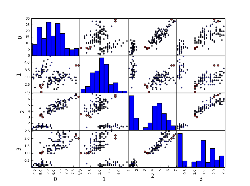
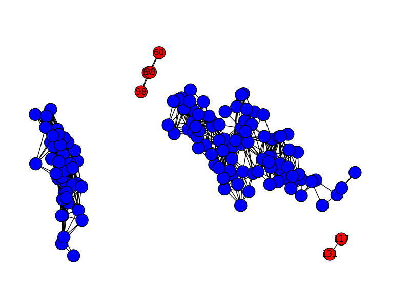
The pairs plot it a great way to visualize the data, but if we had more than 4 dimensions this wouldn’t be a viable option. Instead, let’s reduce the dimensionality of the data using PCA just for visualization purposes. While we’re at it, let’s actually visualize how the observations are connected in the graph components to get a better idea of what the algorithm is doing.
from sklearn.decomposition import PCA
g = res['g']
X_pca = PCA().fit_transform(df)
pos = dict((i,(X_pca[i,0], X_pca[i,1])) for i in range(X_pca.shape[0]))
colors = [node[1]['color'] for node in g.nodes(data=True)]
labels = {}
for node in g.nodes():
if node in res['classed']['anomalies']:
labels[node] = node
else:
labels[node] = ''
nx.draw(g, pos=pos, node_color = colors, labels=labels)
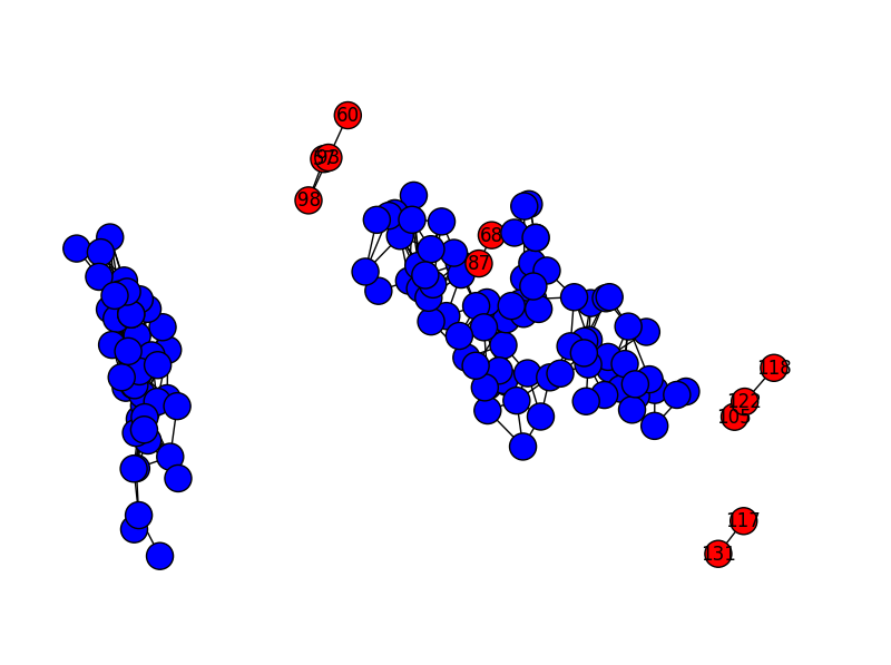
plt.show()If we reduce the graph resolution, we get more observations classed as outliers. Here’s what it looks like with rq=0.05 (the default–above–is 0.10):
And here’s rq=0.03:
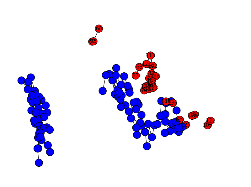
In case these images don’t give you the intuition, reducing the graph resolution results in breaking up the graph into more and more components. Changing the ‘p’ parameter has a much less granular effect (as long as most of the observations are in a small number of components): changing ‘p’ will have basically no effect for small increments, but above a threshold we end up classifying large swathes of the graph as outliers.
The images above have slightly different layouts because I ran PCA fresh each time. In retrospect, it would have looked better if I hadn’t done that, but you get the idea. Maybe I’ll fix that later.