

No, I didn’t go to the store and buy a panda. In fact, the national zoo here in DC lost a panda fairly recently :(
The title of this post is meant to contrast my last posts frustration: I’m starting to get the whole pandas thing.
When I last played with my reddit data, I produced an interesting graphic that showed the reddit activity of DC area redditors. In my analysis, I treated the data as though it were descriptive of the redditors as individuals, as though it were an average of each individual’s usage pattern, but really it was aggregate data. I’m interested in trying to characterize different “kinds” of redditors from their usage patterns, and hope to also build a classifier that can predict a user’s timezone. The obvious next step in my analysis was to get more granular and work with the individual users. As I mentioned in my last post I’m challenging myself to do this analysis in python.
My dataset resides in a SQLite database. I have extensive experience with SQL at work, where I basically live in an oracle database, but I’m lucky in that I can do most of my analysis directly in the database. I’m still getting the hang of how applications I program should interface with the database. So, like any noob, I started out by making a pretty stupid, obvious mistake. Let me show you what my code looked like when I started this analysis:
"""
NB: This code is for sample purposes only and represents
what NOT to do. The better solution is posted directly below.

Many of my posts describe good code in the context of bad code:
if you're going to cut and paste from anything I post here, please
make sure to read the whole post to make sure you aren't using the
bad solution to your problem.
"""
import database as db
from datamodel import *
import sqlalchemy as sa

s = db.Session()

def get_users(min_comments=900):
    usertuples = s.query(Comment.author) \
    .group_by(Comment.author) \
    .having(sa.func.count(Comment.comment_id)>min_comments) \
    .all()
    usernames = []
    for u in usertuples:
        usernames.append(u[0])
    return usernames

def get_comment_activity(username):
    """
    Gets comments from database, develops a "profile" for the user by
    summarizing their % activity for each hour in a 24 horus clock.
    Could make this more robust by summarizing each day separately
    """
    comments = s.query(Comment.created_utc)\
            .filter(Comment.author == username)\
            .all()
    timestamps = []
    for c in comments:
        timestamps.append(c[0])
    return timestamps

def profile_user_hourly_activity(data):
    """
    Returns profile as a total count of activity.
    Should ultimately normalize this by dividing by total user's activity
    to get percentages. Will need to do that with numpy or some other
    numeric library.
    """
    pivot = {}
    for d in data:
        timestamp = time.gmtime(d)
        t = timestamp.tm_hour
        pivot[t] = pivot.get(t,0) +1
    return pivot

users = get_users()
profiles = {}
times = []
for user in users:
    comments = get_comment_activity(user)
    profiles[user] = profile_user_hourly_activity(comments)
I’ve simplified my code slightly for putting it up on this blog, but it used to contain some print statements inside the for loop at the bottom so I could see how long each iteration was taking. On average, it took about 2.2 seconds to process a single user. That means to process all 2651 users in my database, it would take about an hour. HOLY CRAP! Instead of fixing my problem, I decided to trim the dataset down to only those users for whom I had been able to download >900 comments (hence the min_comments parameter to get_users), reducing the dataset to 564 users. I actually ran the code and it took 21 minutes. Absolutely unacceptable. What’s the problem?
I/O IS EXPENSIVE.
This is a problem I’ve made before in the past, and it always leads to significant performance gains if it can be eliminated. Like, code that once took 18 hours finished in about 4 minutes running on the same data set because I minimized the I/O (in that instance it was file read/writes).
Instead of a separate database call for each user, let’s hit the database once and slice the data as necessary from inside python.
import database as db
import pandas as pd

s = db.Session()
data = s.query(Comment.author, Comment.comment_id, Comment.created_utc).all()

author        = [a for a,b,c in data]
comment_id    = [b for a,b,c in data]
timestamps    = [time.gmtime(c) for a,b,c in data]
created_dates = [dt.datetime(t.tm_year, t.tm_mon, t.tm_mday, t.tm_hour, t.tm_min, t.tm_sec) for t in timestamps]

df = pd.DataFrame({'author':author, 'comment_id':comment_id}, index=created_dates)
Much better. Also, putting it in the data frame object makes the rest of the analysis much much easier. Well… easier in terms of how fast the code runs and how little I need to write. I’m still learning pandas so doing it the “hard” way actually produces results faster for me, but I’m not on a deadline of anything so let’s do this the right way.
grouped = df.groupby(['author', lambda x: x.hour]).agg(len)
grid    = grouped.unstack()
Holy shit that was easy.Since that happened so fast you might have missed it, those two lines of code are summarizing my data set by user to give a profile of their sum activity by hour. Did I mention this code takes about a minute to run (compare this with the code at the top of the article that would have taken a full HOUR).
Here’s how to plot this and what we get:
import pylab as pl
pl.plot(grid.T)
pl.show()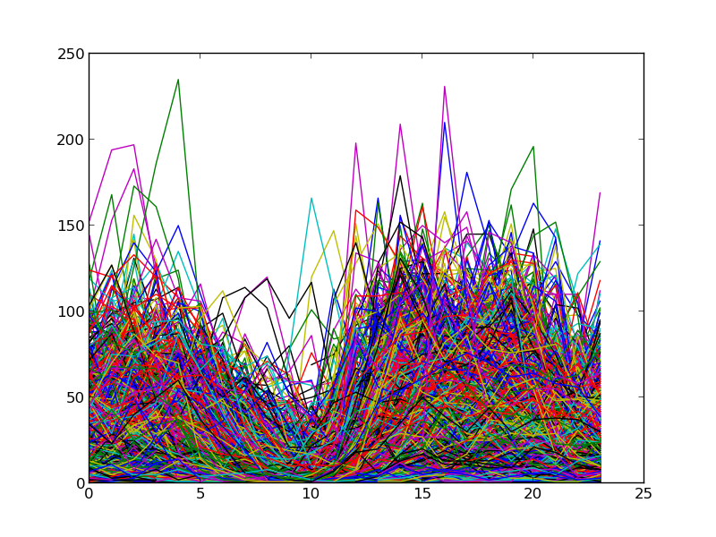
NB: Times here are in UTC (EST=UTC-5). Also, although I didn’t go to the trouble of labeling axis, you can tell pretty quickly: the x-axis is hour, the y-axis is count.
You can see that there’s a lot of diversity in these users, but there’s a very clear pattern here which is clearly consistent with the graphic I produced in my first pass at this. Let’s take a look at that pattern in a broad way by taking the average of the elements composing this graph:
pl.plot(grid.mean())
pl.show()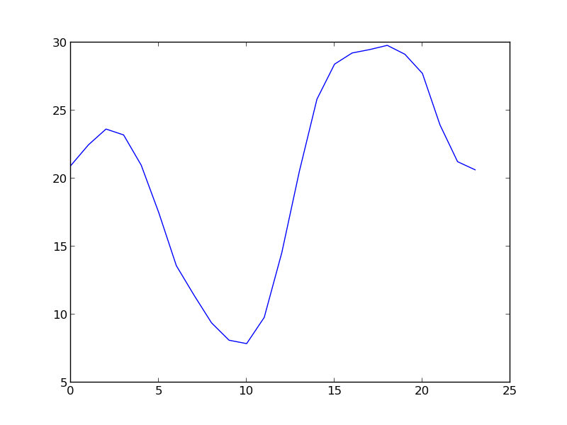
Man…pandas makes everything so…simple! And it integrates crazy nice with matplotlib (imported here as part of pylab).
As I mentioned at the top, I suspect that there are distinct user categories that I can identify from how people use the site, and my immediate hypothesis is that I can find these categories based on the times people use the site (e.g. people who browse predominantly at work, people who browse predominantly after dinner, people who browse predominantly on the weekends, etc.). I was having a ton of trouble installing scikit-learn so I cheated and did some analysis in R. Here’s what PCA of this data looks like (just to add more pretty pictures):
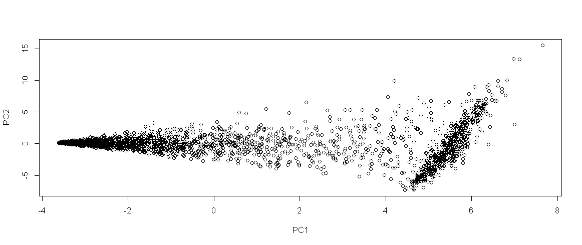
Obviously the clusters just aren’t there yet. Maybe there are two: the horizontal ellipse on the left and the vertical ellipse on the right (maybe), but more likely instead of distinct user types, it looks like there may be a predominant user type (the right blob), and then a fully populated spectrum of other usage styles. I can’t remember if I generated this using the full data set, or just the users for whom I had >900 data points, so I could be wrong. I guess I’m going to need some more features.
Anyway, enough blogging. I’ve got a mid term this week and am taking a rare night off from my books to play around with this data, and instead of coding I’ve been writing up analyses I’ve already done. Time to play!